Back in 2006, I read an article published by Oliver Reichenstein. Even in 2013, one thing about it really sticks out to me. It is the rather simple point that 95% of what is on the web is typography. I had never thought about that before, but it is true. The internet is primarily text based, even on videos of images where there is at least some context explained in the description. Which means that the majority of the web is made up of typography in one form or another.
This might seem rather obvious, but I had genuinely never considered the true impact of typography on the web, or in web design. Even a website that is almost entirely images would have to have some text t get to a secondary page. If you had no secondary page and it was all a single page with no text on it at all, you still have the typography used for the URL. There is no way to have a website that doesn’t incorporate typography in a viewable form in some way. That doesn’t even take into consideration the text used for coding behind the scenes.
For me, this is an incredible fact. The web is this interwoven collection of languages and text, something I might never have realized had I not read Mr. Reichenstein’s piece.
When looking to effectively incorporate typography into your web design, it is about more than just going with what looks pretty on the page. By thinking of it as being dynamic in the face of so much content, you instead have to stand out among that 95%. Using certain tips and examining the trends can be a good way to do that.
Trends In 2013

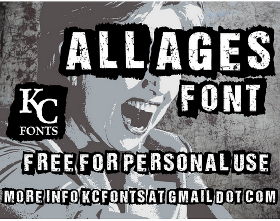
- Grunge Fonts – Fonts that throw back to the 90’s grunge movement, such as what you would have seen on album covers and show posters, have been making the rounds a lot this year. Especially on websites for apps and programs. A few examples are All Ages, Scorched Earth and the more grunge chic font Dirty and Classic.
- Large Fonts – Web designs that use huge lettering as their primary design have been more popular this year than ever before. They sit in the center of the page, acting as a header with smaller fonts beneath that better expands on what they are trying to advertise. Often these designs don’t rely entirely on typography, but are broken up by images and sign-up forms. A good example if ShopFlow, which uses large text but doesn’t let it entirely overpower the site.
- Going Vintage – A lot of vintage looking typography is being used lately, and this is probably my favorite trend of the year. Whether it is handwritten script or something that looks like it might have been made from a classical typewriter, there are some really great examples out there. Pinfluence has several types of typography on their site, but the header is very vintage in look. Another rather nice font I have seen used on several blogs lately is Mercury Script from Creative Market.
Tips For Using Typography In Web Design

- Keep It Simple – I am not one of those people who will insist that you use a single font for a web design. It comes out looking bland, quite often, or more like a blog post than a website. But you shouldn’t overdo it, either. Two or three fonts will usually suffice, and create a dynamic design that can really pop.
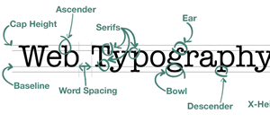
- Offer Plenty of Empty Space – Having your text too close together can ruin the design, even with the perfect font selected. Properly measure the space between every line, so it looks more clean and less cluttered. You should also measure space surrounding the area containing the text, as well as the kerning (space between letters). All pacing should be consistent, and these subtle changes can make a big difference, especially when using serif fonts.
- Use Pronounced Headers – Whether you are doing an entire paragraph with a more pronounced font/size, or just the beginning letter, it is important to pronounce the beginning of sections with something that stands out. With an article, this can be as simple as just using bold to breakup the text. But in a design a more creative approach is necessary to differentiate one section from another when skimming the page.
- Select Colors By Readability – That design you developed with the light pink font might seem pretty cool. But it might not be optimized for all users, and so can negatively impact the end result. You don’t want anything that could create eye strain, look wrong on mobile devices or potentially be invisible to those with color blindness. Contrast is a great way to select a color, such as light fonts on dark backgrounds, or dark fonts on light backgrounds. Small differences in tint are usually all that is needed for a creative design, like dark blue instead of black.
Have any tips on using typography in web design? Or have you seen some examples of trends this year that you think hold merit? Let us know in the comments.
Our guest blogger Michelle is the creative blogger for Dobovo.
We take typography very seriously!
