 Landing Page Design: How to Create Killer Landing Pages
If you engage in online advertising to increase traffic to your site and are not utilizing landing pages, you have failed. Landing pages are a critical part of improving conversions, boosting your ROI and increasing leads. Let’s take a closer look:
What is a Landing Page?
A landing page is a web page designed to capture a visitor’s information through a form on your website. Companies utilizing email, display or social advertising campaigns should always send their traffic to a targeted landing page.
Unfortunately, instead many companies send visitors to the home page and end up wasting valuable marketing dollars. Failure to send a targeted stream of traffic coming to your site to an appropriate landing page results in the loss of revenue and major opportunity.
What differentiates you from the competition?
Your landing pages should always be easy to read, to navigate and above all else should clearly communicate what it is you want the visitor to do and the value you are providing them.
Other Critical Elements to Include:
Value.
Always offer something of value to your audience. Not only does this begin establishing and building a relationship but they need a reason to give you their information – and it needs to be good. Begin by establishing your goals – what do you want them to do – and go from there. If your goal is to collect emails you could come up with a valuable offer, such as a free e-book or exclusive discount, in return for a newsletter signup or simply providing their contact information.
Compelling Headline.
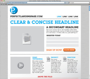
Write clear and concise headlines. When someone arrives on your page it should be consistent with what they expected to see based on the link they clicked on to arrive there.
Web Writing.
Do not ask for unnecessary, personal information – most people will become suspicious or annoyed by a company that is asking for too information. For instance, often times when I am asked to enter my phone number the first thing I think is, “Are they going to call me?” and then I click the back button. Always use an engaging call-to-action as the text for your button. Avoid using words like “submit” but instead use things like “download your free whitepaper” or “register for free”.
Limit Text.
Limit your text by being as concise as possible. Break up text using visual cues like photos or graphs. Split up ideas into subcategories with their own headlines and use bullet point lists.
Limit Navigation.
Eliminate distractions and highlight your primary goal or call-to-action. Limiting navigation helps to avoid a visitor getting sidetracked or clicking on a different offer and leaving the page without completing your goal. Keep the form above the fold or consider including an additional call-to-action placed above the fold so your user doesn’t have to scroll down to convert.
Testing.
Create two almost identical landing pages and test which headlines or images convert better with your target audience. Always continue to test, incorporating the elements from the winner and constantly improving your conversion rates.
Our guest blogger James Larson is a Copywriter for Minneapolis Web Design. When he isn’t dreaming up the next big idea for their clients’ web and content strategy, James is traveling the world with his band and living life to the fullest.