Category Archives: Web Design

The Importance Of Content Creators

digital content creatorsLesser Known Positions in Web Design

When you think about a web design company, there are positions or people that come to mind right away. The designer is usually the first person you think about but this is not the only person that helps in making extraordinary websites. A good web design firm will have multiple people who each have their own job to do. By specializing in just one area, the entire group can work much more efficiently. They can each focus on their task and make sure it’s done to the maximum effort. Apart from the designer, there are other people who will work on your site to ensure it is of the highest quality and usability. These lesser known positions are just as important to the overall web design project.

SEO Writers

The job of an SEO writer is to research different keywords and content that should be included in your site. This person will make suggestions to get your site the most traffic possible. A good SEO writer will help your site be more accessible and found on the search engines like Google, Bing, Yahoo! etc.   Most potential customers will use these search engines to look for whatever they need. It is a good idea to hire an experienced SEO writer because they can make a world of difference in terms of the amount of traffic your site will receive from potential customers. This is not an area where you can settle on working with just a mediocre person.

Internet Copywriter

This person’s job is to create written content on the page to attract targeted viewers. They will work closely with the SEO writer and together form a team whose only job is to attract targeted traffic to your site. For example, let’s say your business is carpet cleaning in the Houston, TX area. Some keywords you may want to use would be “carpet cleaning in Houston”. The reason for this is that anybody who searches for this keyword already wants the type of business you offer and is ready to hire somebody. The internet copywriter will work hand in hand with you and the SEO writer to come up with a list of keywords that will get your site the targeted traffic it needs to convert it into actual jobs.

All in all, these lesser known jobs are just as important in a web design firm. Keep in mind that smaller firms will have one person who handles multiple facets of the job. That is completely ok as long as they can provide the quality work and attention that your site deserves. All large firms started small at one point so I will definitely vouch for a good professional firm even if it is made up of only a few people. Getting back to these positions, they all fill important tasks that have to be completed to make your site the best it can possibly be. Do not overlook any of these services and make sure you get the best people working on your side.

Our Guest Blogger, Riley Hill loves self-improvement books and plans to one day write his own book. He also loves learning everything that is new about Internet marketing thus it’s common to find him reading articles at PrimeOnlineSolutions.com a Miami based web design company. Moreover, he has a passion for learning in just about any field.

Impact Of Typography On Web Design + Tips & Trends

Typography In Web Design

Back in 2006, I read an article published by Oliver Reichenstein. Even in 2013, one thing about it really sticks out to me. It is the rather simple point that 95% of what is on the web is typography. I had never thought about that before, but it is true. The internet is primarily text based, even on videos of images where there is at least some context explained in the description. Which means that the majority of the web is made up of typography in one form or another.

This might seem rather obvious, but I had genuinely never considered the true impact of typography on the web, or in web design. Even a website that is almost entirely images would have to have some text t get to a secondary page. If you had no secondary page and it was all a single page with no text on it at all, you still have the typography used for the URL. There is no way to have a website that doesn’t incorporate typography in a viewable form in some way. That doesn’t even take into consideration the text used for coding behind the scenes.

For me, this is an incredible fact. The web is this interwoven collection of languages and text, something I might never have realized had I not read Mr. Reichenstein’s piece.

When looking to effectively incorporate typography into your web design, it is about more than just going with what looks pretty on the page. By thinking of it as being dynamic in the face of so much content, you instead have to stand out among that 95%. Using certain tips and examining the trends can be a good way to do that.

Trends In 2013

Grunge fonts

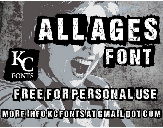
  • Grunge Fonts – Fonts that throw back to the 90’s grunge movement, such as what you would have seen on album covers and show posters, have been making the rounds a lot this year. Especially on websites for apps and programs. A few examples are All Ages, Scorched Earth and the more grunge chic font Dirty and Classic.
  • Large Fonts – Web designs that use huge lettering as their primary design have been more popular this year than ever before. They sit in the center of the page, acting as a header with smaller fonts beneath that better expands on what they are trying to advertise. Often these designs don’t rely entirely on typography, but are broken up by images and sign-up forms. A good example if ShopFlow, which uses large text but doesn’t let it entirely overpower the site.
  • Going Vintage – A lot of vintage looking typography is being used lately, and this is probably my favorite trend of the year. Whether it is handwritten script or something that looks like it might have been made from a classical typewriter, there are some really great examples out there. Pinfluence has several types of typography on their site, but the header is very vintage in look. Another rather nice font I have seen used on several blogs lately is Mercury Script from Creative Market.

Tips For Using Typography In Web Design

  • Keep It Simple – I am not one of those people who will insist that you use a single font for a web design. It comes out looking bland, quite often, or more like a blog post than a website. But you shouldn’t overdo it, either. Two or three fonts will usually suffice, and create a dynamic design that can really pop.
  • Offer Plenty of Empty Space – Having your text too close together can ruin the design, even with the perfect font selected. Properly measure the space between every line, so it looks more clean and less cluttered. You should also measure space surrounding the area containing the text, as well as the kerning (space between letters). All pacing should be consistent, and these subtle changes can make a big difference, especially when using serif fonts.
  • Use Pronounced Headers – Whether you are doing an entire paragraph with a more pronounced font/size, or just the beginning letter, it is important to pronounce the beginning of sections with something that stands out. With an article, this can be as simple as just using bold to breakup the text. But in a design a more creative approach is necessary to differentiate one section from another when skimming the page.
  • Select Colors By Readability – That design you developed with the light pink font might seem pretty cool. But it might not be optimized for all users, and so can negatively impact the end result. You don’t want anything that could create eye strain, look wrong on mobile devices or potentially be invisible to those with color blindness. Contrast is a great way to select a color, such as light fonts on dark backgrounds, or dark fonts on light backgrounds. Small differences in tint are usually all that is needed for a creative design, like dark blue instead of black.

Have any tips on using typography in web design? Or have you seen some examples of trends this year that you think hold merit? Let us know in the comments.

Our guest blogger Michelle is the creative blogger for Dobovo.
We take typography very seriously!

Landing Page Design: Creating Killer Landing Pages

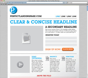
Landing Page DesignLanding Page Design: How to Create Killer Landing Pages

If you engage in online advertising to increase traffic to your site and are not utilizing landing pages, you have failed. Landing pages are a critical part of improving conversions, boosting your ROI and increasing leads. Let’s take a closer look:

What is a Landing Page?

A landing page is a web page designed to capture a visitor’s information through a form on your website. Companies utilizing email, display or social advertising campaigns should always send their traffic to a targeted landing page.

Unfortunately, instead many companies send visitors to the home page and end up wasting valuable marketing dollars. Failure to send a targeted stream of traffic coming to your site to an appropriate landing page results in the loss of revenue and major opportunity.

What differentiates you from the competition?

Your landing pages should always be easy to read, to navigate and above all else should clearly communicate what it is you want the visitor to do and the value you are providing them.

Other Critical Elements to Include:

Value.

Always offer something of value to your audience. Not only does this begin establishing and building a relationship but they need a reason to give you their information – and it needs to be good. Begin by establishing your goals – what do you want them to do – and go from there. If your goal is to collect emails you could come up with a valuable offer, such as a free e-book or exclusive discount, in return for a newsletter signup or simply providing their contact information.

Compelling Headline.

Write clear and concise headlines. When someone arrives on your page it should be consistent with what they expected to see based on the link they clicked on to arrive there.

Web Writing.

Do not ask for unnecessary, personal information – most people will become suspicious or annoyed by a company that is asking for too information. For instance, often times when I am asked to enter my phone number the first thing I think is, “Are they going to call me?” and then I click the back button. Always use an engaging call-to-action as the text for your button. Avoid using words like “submit” but instead use things like “download your free whitepaper” or “register for free”.

Limit Text.

Limit your text by being as concise as possible. Break up text using visual cues like photos or graphs. Split up ideas into subcategories with their own headlines and use bullet point lists.

Limit Navigation.

Eliminate distractions and highlight your primary goal or call-to-action. Limiting navigation helps to avoid a visitor getting sidetracked or clicking on a different offer and leaving the page without completing your goal. Keep the form above the fold or consider including an additional call-to-action placed above the fold so your user doesn’t have to scroll down to convert.

Testing.

Create two almost identical landing pages and test which headlines or images convert better with your target audience. Always continue to test, incorporating the elements from the winner and constantly improving your conversion rates.

Our guest blogger James Larson is a Copywriter for Minneapolis Web Design. When he isn’t dreaming up the next big idea for their clients’ web and content strategy, James is traveling the world with his band and living life to the fullest.

SEOPressor Plugin Review

SEO plugin for WordPressOptimisation of onsite content for better SEO is something that’s always been and most likely always will be important. In essence, all SEO tools are there to help you rank better and SEOPressor is no different to the rest in that regard. So, let’s take a more in-depth look into the WordPress plug-in.

On-Page Management

Like most other tools of this nature SEOPressor looks at the usual variables, including length, keyword placement, keyword density, font decorations, images, links, and overall SEO score. However, in addition to this it also adds fonts and inserts alt text to images automatically. It also suggests modifications and warns of over optimisation also – a very useful feature, albeit a quite common one

Another useful addition is the fact that it supplies you with a full list of LSI keywords, taken directly by the plug-in from the search engine. This allows you to make your text that little bit broader in SEO terms and is something of benefit.

Linking with SEOPressor

Another thing that was impressive about SEOPressor was the fact that it allowed you to specify the specific keyword you want to link to and then do so to an individual URL. The plug-in then automatically does so for similar operations in the future. It also allows you to use snippets from SERPs and fully customise these snippets and what they show. This is ideal for those advertising on their blogs.

Social Media

SEOPressor also utilises social media and provides support for Facebook OpenGraph and Twitter Card too. This allows you to increase a sites visibility and integrate search to bring more views and more traffic to your site – always a nice benefit.

Slow

One of the things that we didn’t notice, but was mentioned regularly was that SEOPressor causes sites to slow down slightly after installation. This perhaps is down to the font decoration of keywords. In addition, we’d also say that due to the fact that the plugin tends to decorate keyword fonts, it could potentially lead to the chance of over optimisation.

Costs

Of course, because of the market and the number of competitors offering similar products price is central here. The licence for one site is $47, while a unlimited licence is $97. So, we’d say that when looking at the competition, it’s expensive for one and good value for an unlimited site licence that’s both unlimited as regards time and also the number of sites you can place it on.

The main competitors are ClickBumpSEO, Easy WP SEO and PushButton SEO all of which vary in their quality and pricing, though provide most of the options of SEOPressor.

SEOPressor comes out well against all three of these, though due to the price of Easy WP SEO it’s possibly not the best option for everyone out there (Easy WP SEO is lower in price and offers analysis of the whole HTML document, not just the content). However, it’s a very useful addition to any WordPress site and makes onsite optimisation a lot easier.

Our guest blogger, Cormac Reynolds, writes for UK digital marketing site www.mysocialagency.com and has worked in the area of social media and SEO for a number of years now.