Category Archives: responsive web design

SEO For Startups

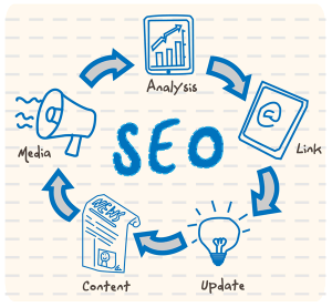
seo-for-startupsStartups have many things to worry about, so it’s not surprising that sometimes they neglect SEO. That’s detrimental to their websites because search engine optimization can bring them online exposure, as well as help them establish a more powerful online presence more quickly. If you run a startup yourself, hiring a SEO company may prove to be one of the best investments that you ever make for your business. But that doesn’t mean that you shouldn’t do some optimization on your own for your website, before the experts arrive.

What to Focus On

First you have to make sure that when someone enters your company’s name in Google, Yahoo!, and Bing, the first result that the search retrieves is your website. This is done most of the time by the search engines automatically. Once that is done, you need to focus on optimizing your web pages for search engines, so that when someone searches for keywords that define one of your offerings, your website appears as high as possible in the search results. Ranking first is tough if there is strong competition in your niche, but you must struggle to make it to the first page of the results, because few people check the second page. The SEO for startups strategies below will help you get more exposure, but to really make it on the first page you need the help of an SEO expert.  A SEO company can help you out to make your local business grow in all of the San Francisco area. There are some good companies that are offering SEO services for small fees. Make sure that you always check their portfolio before hiring one.

  • Invest in high-quality web design. A bad, cluttered design can ruin all your SEO efforts.
  • Use Google Analytics and Google Webmasters Tools to monitor your website and get more insight into how your visitors are using it.
  • Make a list of your offerings and come up with relevant keyword ideas. You can use Google Keyword Planner to check how the keywords perform. The best keywords are those that have a high volume but a relatively low cost per click.
  • Ensure that every page on your website has a friendly URL, a unique title, and adequate page tags.
  • Make all website pages accessible in less than 3 clicks from the home page.
  • Fix any broken links.
  • Put your sponsors, endorsers, and partners in a visible location – on the homepage if there’s enough space – and link to their websites.
  • Add keyword-optimized content to your website, including images and videos.
  • Set up a blog on your domain and publish on it worthwhile content weekly, including in your posts links and references to your events and offerings.
  • Optimize your website for mobile devices, making sure that it displays well on all the popular smartphones and tablets used today.

These are only a few things that startups can to do improve their SEO. Save yourself the trouble to apply all these tips yourself by hiring a reliable SEO company. You have nothing to lose.

Citations:

As a marketing expert who has experience with online advertising, our guest blogger Josh loves to share his expert advice. He regularly researches the evolving SEO trends, and provides consultation to a bay area SEO company. You can check his contribution on Google+.

With the Webby Awards Deadline Looming, We Tip Our Hats to Top Web Designs

Webby AwardsThe entry deadline for the next Webby Awards is Nov. 1, and next spring’s ceremony marks the 18th year in a row since the International Academy of Digital Arts and Sciences organized the event to recognize achievement in Web design and Internet excellence. The Webbies represent one of several major events celebrating top web designs, including the CSSDA, the Interactive Media Awards and the WebAwards, among others. Studying the winners of such awards is a great way for designers to learn secrets of the field.

Winning Criteria

What makes for good Web design in today’s mobile-oriented environment? Awwwards.com, which gives top Web designers recognition and prestige, identifies 10 trends in contemporary Web design. These include:

  • Putting content first
  • Simplifying design interaction and content
  • Centering on user experience
  • Providing app-style interfaces
  • Unifying desktop and mobile appearance.

Ultimately, any design is only as good as its functional delivery. If customers find designs too slow to load, their visual value will be lost. Choosing a fast hosting provider using resources at www.InternetProviders.com can help ensure site visitors appreciate your aesthetic efforts.

Winning Web Designs

This September, digital advertising agency LIQWID won the Web Marketing Association’s 2013 WebAward for Best Advertising Website. This marks the fourth major recognition LIQWID has received over the past year, making its site a design model to pay attention to.

LIQWID offers advertisers a solution to the challenge of responsive Web design. Where design once centered around desktop displays with fixed width in Internet Explorer and Firefox, today’s mobile orientation means design must display across screen sizes ranging from smartphones to HDTVs as well as a diverse collection of operating systems and browsers.

For ad designers, this poses the problem of how to make the same ad display equally well in different venues. LIQWID solves this problem by using fluid Web design principles to create ads that automatically collect information from the displaying device for instant resizing to any size, resolution or screen location. This enables the same ad to look just as good on a desktop, laptop, tablet or smartphone.

Appealing Apps

Each year, Apple’s Worldwide Developers Conference hosts the Apple Design Awards to recognize apps that further design, technology and innovation. One of this year’s winners was the Yahoo Weather app for iPhones and iPads, which provides a great case study for blending aesthetic appeal with functionality.

Apple strives to combine beauty with simplicity, and the tech giant praised the Yahoo Weather app for embodying this ideal. The app provides a high-quality background photo based on the geographical location of the place the user is querying about. This combines with elegant foreground typography, which supplies the relevant functional information, including place, time, current temperature and sky conditions and forecasting outlook. Compare the result with the generic ugliness of many weather sites, and you’ll see why Apple recognized this app for its visual achievement.

By Peter Marino, Owner and CDO of the SEO & Inbound Marketing company reelWebDesign.com.

5 Reasons to Redesign Your Website with a Responsive Web Design Format

Responsive Web Design

Responsive Web Design can engage your customers more by giving them a friendlier user-interface.

What is responsive/adaptive web design?

Responsive web design (or sometimes referred to as adaptive web design) is the process of making a website that will adapt appropriately to any screen size. From desktop, to tablet, to mobile phone, your website will look and feel appropriate to the device it’s being viewed upon.  As screen sizes become smaller, a responsive website re-prioritizes content and modifies its design on the fly to meet the needs of users on any given device, thereby presenting a friendlier user-interface.

Here are 5 reasons to make your website responsive:

  1. Eliminates the need to create a mobile-only website.
  2. It’s optimized for performance on mobile devices.
  3. No need to update your mobile website and your desktop website when it’s all in one!
  4. The user interface experience is better across all devices.
  5. Helps you rank higher on the search engines! Yes, Google prefers responsive sites!

If you are planning to redesign your website I recommend making the upgrade to a responsive one. Unfortunately, redesigning your style-sheets and updating your current websites HTML to become responsive can be as expensive as getting a new website created. It is much more cost effective to make a new website responsive from the start, and that’s why I encourage all new web design clients to make their site adaptive.

Want to see it in action? If you’re on your desktop computer (or laptop) adjust the size of your browser to different sizes and you’ll see the website readjust according to the screen size.
That’s responsive web design in action. I’ll be recreating my main website (reelWebDesign.com) to be fully responsive soon, so keep an eye out. If you’d like a sneak peak to see what it will look like just email me.

By Peter Marino