Category Archives: HTML5

I was quoted in Website Magazine this month…

Peter Marino, Chief Designer and CMO of New York-based HTML5 Web design and social media marketing firm, reelWebDesign.com:

“Although I can not speak for all Web designers I would have to say my biggest problem is getting a constant flow of new clientele. If you work for yourself you probably understand what I mean. Therefore, I think it’s important that all designers understand SEO and some PPC marketing in addition to their design skill-sets. If you don’t have a webmaster tools account for both Google and Bing you need to open one and figure out how to utilize all of the components in it. In addition to this you should have an AdWords/AdCenter account in both Google and Bing respectively.”

See the full article here:

Typography Tutorial: Typography as a Designer’s Declaration of Independence: A

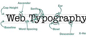
Typography
Tired of using the same old standard fonts in all your web pages? For too long now basic fonts like Georgia, Verdana and Arial have ruled the day on most websites. More than ever, modern design aesthetics demand variety to allow your web page to be notable and declare a truly unique entity. Use the below typography tutorial to make your website unique today!

@Font-Face

Until @font-face showed up in the CSS world, however, there simply wasn’t a reliable method of including unique fonts that would be viewable through all different web browsers. All the major browsers, Chrome, Firefox, Safari, and Internet Explorer now support @font-face, which has lead to a proliferation of new stylistic options without resorting to images for fancy fonts.
{NOTE: This will also help your search engine optimization since the text will be legible by the search engines. This is even more important if the fancy font’s you want to use are being used for H1 headers as opposed to the old method of using images for fancy text headers.}

Choosing a Font

The proprietary rights of font types actually made for one of the big stumbling blocks early on in the development of the @font-face approach. Simply put, not many open source fonts cleared for web use were available until recently.
If you’re purchasing a font, you will need to make sure it comes with a web license, otherwise you could be in violation of intellectual property rights. A simpler solution—especially if you’re working on a budget—is to choose from the many free web fonts available that have sprung up in recent years. Many users enjoy the sites Font Squirrel and Fontex, but Google has also joined in the free font’s game, offering a vast library of open source fonts through a very easy to use platform.

Using @Font-Face

Now that you’ve selected your font, installing it into your CSS style sheet is remarkably easy. All you have to do is include a font-specific rule in your style sheet, referencing the files in a very similar manner as you would an image. This means that you will need to upload your font type to your server in order for your style sheet to access it (unless you are using Google Fonts, which will allow you to source the font directly from its library).

For this example, let’s say we’re using one a font titled “Happy_Monkey”:

@font-face {
font-family: 'Happy Monkey', Arial, cursive;
src: url(/happymonkey.otf);
}

With this code you’ve told your style sheet about a font you’d like to use (“font-family”), and where it can find it (“src”). Here it’s important to note that different browsers recognize different font types. All major browsers, however, recognize “OTF” and “TFF” font types, so you are best sticking to those two.

Now that you’ve told your style sheet about your font, you’ll need to tell it how you’d like to use it. For example, if you’d like to use it as Heading 1, use this code:

h1 {
font-family: ‘Happy Monkey’, Arial, serif; font-weight: 400;
}

If you’d like the font for your body text, simple change the “h1” to say “body.” If you’d like to designate the font for all your text, insert something like this:

body, h1, h2, h3 {
font-family: ‘Happy Monkey’, Arial, serif; font-weight: 400;
}

Please note that’s it’s important to include default fonts so your text will still appear in a manner acceptable to you. In the above code, if “Happy Monkey” failed to load the font would have appeared as “Arial” instead.

Conclusion

The @font face rule is useful, stylistic and easy to implement using CSS3. Designing a website has become more personalized than ever. Enjoy your new tool for independence and personalization!

By: Peter Marino
Peter Marino is the chief designer at reelWebDesign.com. He’s a proficient HTML5 web designer who matches design with the marketing direction of the individual or company who hires him. He can be reached at: peter@reelwebdesign.com. Peter is also for hire as a web design writer.

How to Modify Images or Backgrounds Across Your Website With Simple CSS Code

CSS3Using CSS, you can add effects to your website’s design to enhance its appearance, such as stitched or rounded borders, shadows, and background images. This can all be done with simple CSS3 coding.

For the sake of example, let’s begin with a blank box that you can add these effects to. After that, we will examine how these can be applied to images. You can start by adding a div tag to your HTML, with class=”customclass”.

It will look like this in your HTML file:

Then go into your stylesheet and define your custom id or class.

Here are some basic attributes to get started:


customclass {
background: #55ccaa;
position: relative;
width: 500px;
height: 400px;
margin: 20px;
padding: 10px;
}

BORDER EFFECTS

Thanks to CSS3, adding rounded corners to your box or image is simple.

All you need to do is write this code inside your custom class or id (this can be added to the “customclass” in your css file you just made:

border-radius: 10px;
-moz-border-radius: 10px;
-webkit-border-radius: 10px;

Your box should now have rounded corners. It is important to note that many of these effects will not show properly in Internet Explorer versions prior to version 9.

If you want to add a stitched look to your box, you will need to add two things: the “border” property, and the “box-shadow” property:

border: 2px dashed #ffffff;
box-shadow: 0 0 0 6px #55ccaa;
-moz-box-shadow: 0 0 0 6px #55ccaa;
-webkit-box-shadow: 0 0 0 6px #55ccaa;

The border property adds a fancy border around your content, which is dashed to give it a stitched appearance. Other border styles you can experiment with are solid, dotted, double, groove, ridge, inset, and outset.

The box-shadow property is used here to create a solid line around the dashed border to help with the stitched look, but it can also be used to add a realistic shadow beneath your box. To add a shadow effect, simply add a second shadow in your box-shadow code, so it looks like this:

box-shadow: 0 0 0 6px #55ccaa, 2px 1px 6px 4px rgba(10,10,0,.5);
-moz-box-shadow: 0 0 0 6px #55ccaa, 2px 1px 6px 4px rgba(10,10,0,.5);
-webkit-box-shadow: 0 0 0 6px #55ccaa, 2px 1px 6px 4px rgba(10,10,0,.5);

IMAGES Let’s say you want to keep your new div but put an image in the background.

First, find the dimensions of the image and use those values for the “width” and “height.” Then, change your “background” property like so:

background: #55ccaa url(‘your.image/location.jpg’) no-repeat;

If you want all the images on your page to use these effects, you don’t need to add a div or any HTML at all. Simply add all the CSS to the “img” tag in your stylesheet like so:

img {

border-radius: 10px;
border: 2px dashed #ffffff;
box-shadow: 0 0 0 6px #55ccaa;
-moz-box-shadow: 0 0 0 6px #55ccaa;
-webkit-box-shadow: 0 0 0 6px #55ccaa;
box-shadow: 0 0 0 6px #55ccaa, 2px 1px 6px 4px rgba(10,10,0,.5);
-moz-box-shadow: 0 0 0 6px #55ccaa,2px 1px 6px 4px rgba(10,10,0,.5);
-webkit-box-shadow: 0 0 0 6px #55ccaa, 2px 1px 6px 4px rgba(10,10,0,.5);
}

There you go, a simple but helpful tutorial about using the latest CSS3 styles to your HTML5 website with only minor effort.

Simple as that!

By Peter Marino, Chief Designer and COO of reelWebDesign.com, an HTML5 Web Design company in NYC.