Category Archives: HTML5

How to Make a Website – Understanding and Writing HTML

Photo Credits: c4learn

Maybe you would like to develop a web page or maybe you would like to make nameplates for a website or perhaps you could just be wanting to learn how to control the comments you get on your website all of these things require some knowledge of HTML.

You can easily make a presence on the web by just simply using the social media then creating a personal landing page. However, if you would like to create your own unique website then you will need to learn both CSS and HTML. In this How to start your own blog tutorial we will give you some steps that will greatly help you with creating your own blog and website.

Here is what you will need to have before getting started:

  • A text editor that is plain so this way you can write HTML

  • A web browser that you like because you will need to test out the HTML

  • You must be willing to have a desire to learn HTML

The good news you won’t need much in order to get started on creating your website.
Photo Credits : Graphics_Html

How To Get A Plain Text Editor

If you would like to write HTML then what you will need to get is a plain text editor. One text editor that is not free but is a good one is Textmate but there are other HTML editors which are free such as Notepad ++ on Windows or either Kod on the Mac. Just do a quick research and you will find many other available text editors for either Mac or Windows or for other operating systems.

Understanding HTML Documents

HTML stands for HyperText Markup Language. It’s a lot of texts that you have saved in the document type mode and the browser then identifies that type as HTML. Images on web pages are known as a text that is part of HTML documents.

HTML documents simply just provide instructions which are text based and those instructions can be interpreted on the web browser. The page text in the tags get encapsulated. You can add in line breaks, images and much more when you use HTML documents.

What Do Tags Mean?

A tag is usually used with HTML in order to help with specifying the elements that might be required on the page and then this way the browser knows how to render those things. A set of these type of tags might look something like this:

All of the HTML document that you are currently working on would go inside the tags. The end of the tag usually has / right before HTML. The reason why is because this / helps with the tag being able to close. If you would like to have bold then here is one example of what you would do:
You will find other ways to make the text bold but that is the most common way to make your text bold.

What Is The Basic Structure of HTML Documents?

This is one example of how a basic HTML document structure would look like:
The HTML tags will be located at the head along with the body tags. The reason why is because the head tag helps to encapsulate the information which might not be going on the display page directly. This is just one example of a basic structure of HTML documents on the web but should be enough to help you with understanding it.

Study and Research On How To Make Websites Online

The more you study and research on how to make websites online then the more knowledge you will gain of HTML.

Kennu singh is a real estate agent. He is working in this field for many years.  In his spare time he mostly goes to Philadelphia Real Estate for Sale


Creating and Designing a Brilliant White Website Is An Art?

Today we will be learning about the Anatomy of Colors. Just take a look around and you will see the color white. It’s in your house, at the place you work and it’s somewhere outside. The reason why is because white is both elegant and clean. White is complete and it’s perfection. Absolute is shown through the color white and it represents freedom and it comes loaded with opportunities. White is very important in web design but sometimes creating a web design in white might be difficult.

Photo Credits: G Designer

1. Clean Up Content Clutter With White

When you use the color white you’ll be able to expand space that you might need on your website. This makes a wonderful color to use for interior design plus many enjoy using white for decorating their homes. White can even help with seperating the content on web pages and gives it a clean look. If you have a lot of content on your website it might be overwhelming. Using white is a great way to make your website look clean and not cluttered.

2. Cultural Things To Consider

White is the universal color for both peace and social harmony. If you want to have a house and paint it white then you know it will be a peaceful home. Legend has it that if you have white doors then people entering your house will leave evil on the outside and no evil will be able to enter your home.

White is also used in religions such as Christianity and it’s a symbol of lordship, faith, purity and with truth. It stands for the beginning if white is in clothes. A symbol of justice is wearing white wigs. A symbol of salvation is a white knight. Hospital workers would wear white clothes as a symbol of both cleanliness and salvation.

There are a few cultures in the Indian and Mediterranean countries where white might be used as the color for mourning, however in many places it is a color of purity. European countries use it as the color for traditional wedding dresses because white symbolizes innocence and purity.

3. The Benefits That Comes From Using The Color White

Most people agree that white is immediately associated with purity and cleanliness. When you are designing and creating a website one of the main goals you should have is for your website to be clean. If everything is scattered then you will lose your audience fast.

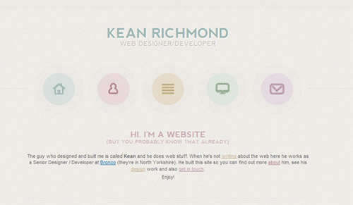
The picture above is a wonderful example of a white and clean website. Everything looks user-friendly, readable and it looks extremely nice. You know where all of the pages are on the site and the images just all blend in together. The site looks simple and the content on the site is placed very well and easy to find.

4. Using White Templates and Layouts

If you find yourself struggling with coming up with a good white template or layout then search the web. You will find thousands of white templates and designs that you can use for your website. Some of the templates might even inspire you with coming up with a unique white design for your website.

Conclusion

Looking at a white website is not only easy on the eyes but it is also calming. It can create a serene feeling and make people want to come back and visit your website again. Creating a website that is white is wonderful for both personal and business websites. Having a white website means having a successful website.

Anthony ShuShang, photographer, creates beautiful photos for a living and knows what it takes to create a brilliant pictures. Find out more details at buy a photo booth.

Businesses Turning To Minimalist Web Design

minimalist websitesOver time, websites have used a wide variety of methods to capture and keep attention. A few years ago, flashing banners and sound effects were common. But now many Internet destinations, including such sites the New York Times, are choosing a “less is more” approach and realizing that many of today’s viewers would prefer clean layouts as opposed to bombarding the senses with movement and noise.

A Responsive Attitude

Since ideals, design, attitudes, and design analytics often change, web design specialists keep their finger on the pulse and strive to know what’s on the horizon before clients even ask for it. Despite some fluctuations for what’s in demand at a given time, some things remain the same.

The New York Times website design will follow suit with what other similar news outlets like The New Republic and USA Today have already done. It’s thought that the streamlined approach will drive advertising dollars because website visitors will have fewer things to distract them.

In many cases advertising dollars keep websites afloat so even as some preferences change there’s a near constant effort to keep advertisers satisfied. But advertisers are only satisfied is their marketing expenditures return the desired results. Whether it be building their specific brand in the marketplace, establishing themselves as an industry expert, or simply driving sales revenues, web design plus function has to be successful in the minds, and budgets, of the advertising community.

Successful web design firms consistently look for ways to stay abreast of website changes. Often, it’s easy to do that by watching to see how some of the most highly trafficked national websites are making alterations and responding in appropriate ways that suit local clients.

A Different Approach to SEO

Both businesses and enterprising individuals looking for online success commonly focus on ways to drive traffic to their websites and encourage visitors to interact with content in meaningful ways that align with their business objectives. However, optimization strategies have shifted over the years, too. Some of the most popular search engines, like Google, change algorithms several times a year and what worked in past years isn’t always similarly beneficial now.

A skilled SEO company will be well aware how over-populating a webpage with certain keywords can quickly cause it to drop in rankings or even disappear from results pages. In this regard, search engine optimization is leaning towards minimalist techniques as well.

Recent algorithm updates have favored websites that use keywords sparingly and instead focus on valuable content that makes sense for particular search strings. Now a website that only uses a few specific keywords could rank much higher than one where the emphasis is on keyword usage over quality.

Some companies that provide SEO services can also create a beautiful and user-friendly website for your needs as well as help you appeal to mobile audiences too. Keep up with recent developments and help viewers enjoy a simpler experience by remembering that it’s not always necessary to go over the top to get the top rankings results.

Our guest blogger, Sandrine Cachette, has worked in the web design industry for the last 8 years. She enjoys reviewing web design portfolios. She writes industry articles for MDesign Media on regular basis.

Using People In Your Web Design – Make It Look Professional Rather Than Awkward

SEO Expert Peter MarinoFor a business there are many requirements that a website has to fulfill  but one of the most important is that it should look professional. You want your website to reflect your organization in only the best light and make it look like you are capable, resourceful and skilled in everything that you involve yourself with. If you have a website that looks sub-par, or that doesn’t have a professional edge to it, then people will instead think that you either lacked the skills and resources, or that you aren’t bothered about doing jobs to the best of your ability. If your website looks like a child made it, then who is going to want to entrust you to handle their finances, or sell them computer parts? What’s to say they won’t be just as shoddy?


With this in mind, using images of real people in your web design is a risky move and one that can go either way. While having people on your site can inspire confidence if it looks professionally done (the assumption would be that you hired professional models and photographers), it can also end up being unintentionally funny if they end up looking awkward or it’s obvious you took the pictures yourself. So how can you ensure that you get the human element right and make your site look corporate and impressive rather than like a fun day out with your friends?


Use the Right Services

The first thing to do is to outsource. You may be tempted to try and do this yourself, but unless you are professionally trained in taking and editing great photos and you have a model friend it won’t look right. Your web design company should be able to handle it for you, but if they can’t make sure you find someone who can.


The Models

You also need to make sure that you find the right models to demo your products or services for you. This means finding people who are attractive because this will make your company look more desirable and successful, and it means dressing them in a ‘power dressing’ kind of way. Look for diversity in your models too and you will make your business appeal to a wider audience.


Additionally you also need to ensure that your models are good actors – if they are even a little bit self conscious it will come across, so ensure they have experience behind a camera before pointing one at them.


Setting

The setting of your photos is equally important. If you have a professional looking work environment that says what you want to say about your business then it’s fine to use that as long as you have the right lighting. Otherwise, see if you can rent somewhere else or speak with your designers.


Editing

The way you edit your pictures can also have a big impact on how effective they are. This is again something best left to the pros, who will be able to enhance the lighting and contrast to give the images that glossy magazine-style feel, and who can use airbrushing to remove any blemishes or mistakes.


Author: Vadim Kirichenko is the brains behind today’s guest post. He likes sharing his views on online marketing and SEO. He says a good advertisement is the one which sells the product without drawing attention to itself. He also says that a good web design is nothing more than creative way of attracting people to your website.

Last updated by at .